Friday afternoon, media buying Slack: “Need the 1:1, 4:5, 9:16, and the store cover by tonight.” Someone crops the hero. The logo clips. The product drifts off-center on story. The cover looks like a different brand. Nobody “failed design.” They used resize thinking when the job was marketplace banner thinking.
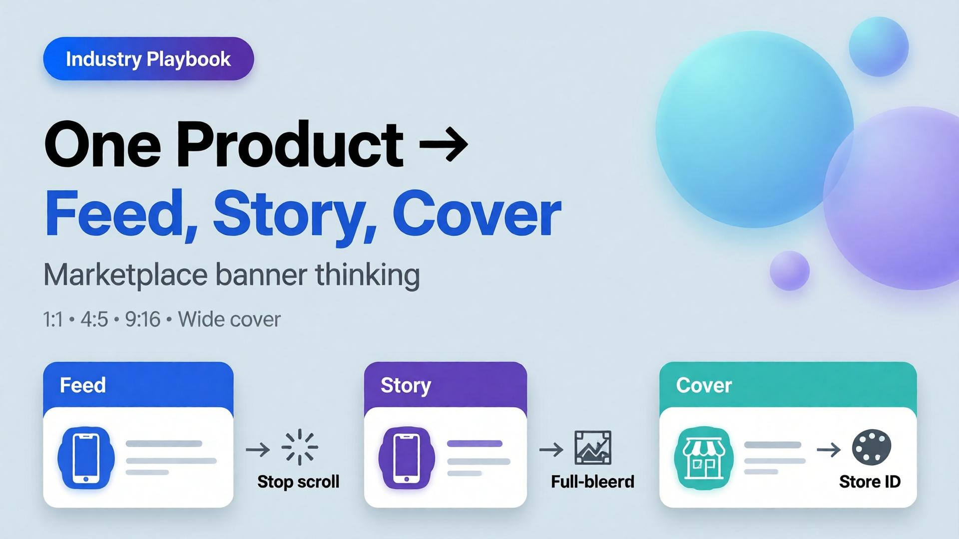
AI marketplace banners are not a folder of stretched JPEGs. They are one creative direction expressed as a ratio family — feed, story, cover — that still reads as one campaign when a buyer sees all three in the same hour.
Key Takeaways
- Resize thinking crops a finished hero. Banner thinking re-composes for safe zones, hook placement, and platform habits.
- Adobe’s 2026 Creators’ Toolkit Report: 57% of creative AI outputs still need moderate or extensive editing before publish — ratio failures are a top silent cause.
- Build from a packshot-true product block, then adapt scene and layout per size — not the other way around.
- Orauria’s Marketplace Banners path is built for feed / story / cover families inside the same Studio workspace as packshot and workflow cleanup.
This spoke sits next to Packshot Thinking: packshots answer “what is the product?”; banner thinking answers “how does that product survive every placement?”
What Is Marketplace Banner Thinking?
Marketplace and paid social surfaces share a brutal constraint: the same SKU must look intentional at three different aspect ratios.
| Surface | Typical job | What breaks if you only resize |
|---|---|---|
| Feed (1:1 / 4:5) | Stop the scroll with product + hook | Crowded center; type too small |
| Story / Reels static (9:16) | Full-bleed mobile interruption | Product crushed; empty sky wasted |
| Cover / banner (wide) | Store or campaign identity | Product postage-stamp; brand unread |
Banner thinking starts with a composition brief per ratio, not with Photoshop’s crop tool.
A multi-size export is not automation of cropping. It is automation of layout decisions you already made — if you never made them, AI will invent three different campaigns.
Why Multi-Size Tools Fail Without a Direction
Feature pages love to promise “one click, all sizes.” That only works when three inputs already exist:
- A true product block (packshot-grade reference)
- A three-line creative direction (how to write one)
- Safe-zone rules per platform (logo, CTA, face/product keepout)
Without those, batch generation produces volume. With them, it produces a system. That is the same distinction as AI ecommerce design vs AI image.
Adobe’s surveys show creators already hop between multiple AI tools in a quarter. Multi-size chaos is what happens when each tool owns a ratio and nobody owns the campaign.
The Feed → Story → Cover Pipeline
1. Lock the product block
Use an approved front or 45° packshot. If you do not have one, stop and build it first — packshot thinking. Banner AI cannot fix a false product.
2. Write one campaign line, three layout notes
Example for an electrolyte pouch:
- Campaign line: Gym-bag fuel, no sugar crash.
- Feed: Product lower-third; sweaty bottle silhouette optional; hook in primary text, not burned in.
- Story: Product mid-frame; vertical negative space for sticker UI.
- Cover: Product left or right third; brand wordmark in safe zone; no tiny legal type.
3. Generate per ratio — do not clone crops
Ask for a re-compose, not a stretch. The product scale, horizon, and negative space should change on purpose.
4. QA the family together
Open 1:1, 4:5, and 9:16 side by side. Fail the set if:
- Cap color drifts between ratios
- Logo treatment changes personality
- Product “grows” or “shrinks” unrealistically
- Any ratio needs a different brand story to make sense
5. Hand off to workflow cleanup
Remove leftover backgrounds, upscale for cover width, crop for marketplace specs — ideally in one Workflow path rather than three downloads. Background removal belongs here when catalog cutouts are required.
Ratio Cheat Sheet (Practical, Not Dogma)
| Ratio | Primary use | Composition bias |
|---|---|---|
| 1:1 | Meta feed, many marketplace tiles | Centered or rule-of-thirds product; short hook |
| 4:5 | Vertical feed | Slightly larger product; less wasted side space |
| 9:16 | Stories, TikTok static companions | Vertical stacking; UI keepout top/bottom |
| 1.91:1 / wide | Covers, some display | Landscape brand field; product as anchor, not speck |
| 728×90 / classic banners | Legacy display | Extreme simplification — often type + logo only |
Exact pixels change by platform and year. The thinking does not: each ratio is a layout problem.
Where Orauria Fits (Without Turning This Into a Manual)
On Orauria you keep the loop inside one creative system:
- Packshot / product truth → solutions/packshot
- Banner & marketplace sizes → solutions/marketplace-banners
- Ecommerce hub → solutions/ecommerce
- Reusable pipelines → workflow library + Studio Guide
Brand Style and Character Library keep color and talent consistent when the same campaign spans static and short video stills. Prompt Library stores the ratio briefs so freelancers do not reinvent Friday panic — see also one workflow template for five clients.
Common Failure Modes
| Failure | Symptom | Fix |
|---|---|---|
| Stretch culture | Distorted bottles | Re-generate layout; never free-transform product |
| Text-in-pixel addiction | Unreadable claims on story | Move claims to platform text; keep art clean |
| Hero monopoly | One beauty shot forced into all sizes | Build ratio family from brief |
| SKU drift | Ads disagree with PDP | Packshot QA before banner batch |
| Tool sprawl | Each size from a different app | One workspace + Brand Style |
Frequently Asked Questions
Can I just upload one image and auto-generate every size?
You can generate volume that way. Campaign-quality families still need a direction, a true product block, and side-by-side QA. Automation amplifies a brief — it does not invent one.
Should marketplace banners match my PDP packshot exactly?
The product should match. The scene and crop should adapt. Exact pixel clones across ratios usually look wrong on mobile.
How is this different from Canva resizing?
Canva resizing moves pixels. Banner thinking redesigns hierarchy for each surface. AI helps when it recomposes; it hurts when it only stretches.
Do I need video if I have strong static ratios?
Not always. Many prospecting tests still win on static. When you do move to motion, keep the same product block and Brand Style so the still and the video feel like one system — inside Orauria’s image + video workspace rather than a separate avatar stack.
What should I do first if my ads look “off-brand” across sizes?
Audit Brand Style (color, type, photography rules), then rebuild one SKU’s ratio family correctly before scaling to 100 SKUs.
Soft next step
If your bottleneck is “every size looks like a different campaign,” start with Marketplace Banners on Orauria and lock feed → story → cover for a single SKU this week. Pair it with a true packshot so the product block never lies.