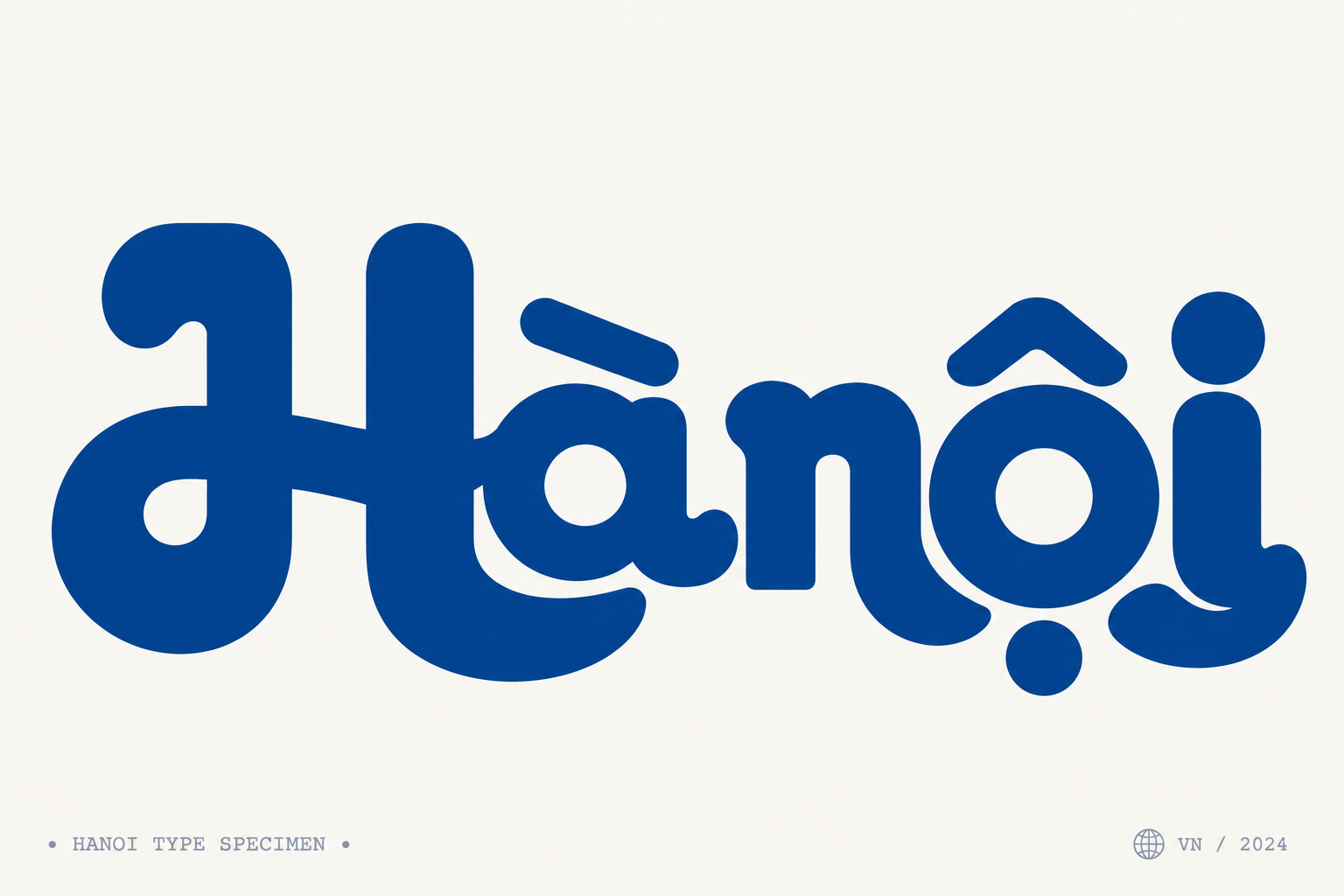
Một kiểu thiết kế chữ Hà Nội cực đẹp
@vũhoànggpt-image-2
Prompt
Typography-first square poster, aspect ratio 1:1, centered custom Vietnamese wordmark reading exactly “Hà nội” and no other main wording. The logotype is the only hero element, placed horizontally slightly below optical center, occupying about 65–70% of canvas width. Style: modern-retro geometric sans mixed with soft script swashes, ultra bold extra-black monoline strokes, deep rounded corners, smooth vector edges, solid fill #155A96. Tight kerning with subtle interlocking: the capital H is a large visual anchor, two thick rounded vertical stems connected by a heavy soft horizontal bar, with slightly bulbous terminals; the “à” is compact and circular, thick bowl, round white counter, short rounded exit stroke tucked close to H; render the Vietnamese dấu huyền on “à” correctly as a thick minimal horizontal/slightly slanted bar above the a, same navy color, not a thin default accent. The “n” is low, dense, with a thick vertical stem and high rounded shoulder, squeezed tightly into the following “ộ”. The “ộ” is geometric and circular with a very thick ring and clean round counter; render the circumflex above o as a bold rounded geometric chevron/cap, and the dot below as a large solid rounded dot centered under the o, both same color and proportionally heavy. The final “i” is a sturdy vertical rounded stem with an oversized circular dot above, aligned cleanly and balanced with the o diacritics; if needed, let the final terminal subtly curl or bulb for retro-script rhythm. Background is flat warm off-white #F7F7F2, no texture, no gradient, no shadow. Add tiny pale gray-blue monospace/typewriter credit marks at bottom left and bottom right as subtle specimen decoration only, not competing with the logo. Professional logo design, crisp legible Vietnamese diacritics, clean gallery whitespace.